🔥 Already 665 students before the full launch! 🔥
Master Data Visualization
with ggplot2
An all-in-one, interactive online course designed to make you a ggplot2 dataviz expert.
😱 Stuck on Beginner Mode?
The ggplot2 📦 is the ultimate tool for creating graphics with code. So powerful that Python made a copy of it!
Yet, reaching a professional level is hard. You have to understand syntax tweaks, navigate a jungle of extensions, learn about different chart types, and master the fundamental principles of dataviz.
It takes time and effort, and without proper guidance, your charts might never reach that stunning, polished look. 😔
🔥 Let's Make Insightful Charts!
This online course packs everything you need to know aboutggplot2 and data visualization.
After just a few hours, you’ll know what to draw and how to draw it, creating stunning and effective graphs that people actually want to read.
Sure, you could keep copy-pasting code from ChatGPT... 🤖
But it won't teach you the secret sauce to design a great chart and you will forever struggle with the last bit of polish that makes your work stand out!
Instead, you could just learn everything in a few hours here thanks to our course!
It's time to transform bland, default charts into stunning, insightful masterpieces!

When I'm asked to recommend examples of beautiful charts designed with the R programming language, Cédric's work is invariably the first that comes to my mind. I think that this is all I need to say about how much I admire his work!

Cédric’s R workshops are an insightful and engaging way to learn how to code and create effective visualizations—clear explanations, beautiful examples, and practical takeaways throughout.
💡 What You'll Learn
The course starts with the basics, making it beginner-friendly, and gradually builds up to deep ggplot2 mastery. Whether you're a total beginner or an intermediate R user, you'll get a lot out of this!
Foundations of ggplot2
A structured introduction to the Grammar of Graphics, the core philosophy behind ggplot2. You'll gain a deep understanding of how aesthetics, geometric and statistical layers, and scales interact to build visualizations with ggplot2.
Mastering the foundations will elevate your entire visualization workflow 🏗️
A solid grasp of the conceptual principles saves time, reduces frustration, and provides the flexibility to tackle any visualization challenge with confidence!
ggplot & dataviz concepts you'll learn:
Customization & Styling
Learn how to customize and style visualizations to make them clear, accessible, and publication-ready. You'll explore themes for consistent design, fine-tune scale_*() functions, customize color palettes, and enhance legends to ensure your plots align with your specific needs and branding.
Creating polished visualizations will allow you to leave a lasting impression 🎨
Moving beyond default settings will help you craft charts that are not only informative but also visually compelling, consistent, and professionally designed!
ggplot & dataviz concepts you'll learn:
Labels, Titles & Annotations
This module covers techniques to enhance readability and communication in your plots. You’ll learn to add informative titles, captions, and annotations, use smart text placement with ggrepel and geomtextpath, and explore advanced text rendering options for better storytelling.
Elevate your storytelling techniques by crafting charts that not just show data—but guide your audience with clarity 🎯
Clear and well-placed text elements make your visualizations more engaging, helping viewers understand key insights at a glance.
ggplot & dataviz concepts you'll learn:
Plot Composition
This module teaches you how to arrange multiple plots into a coherent narrative. You'll learn about small multiples, advanced faceting techniques, and multi-plot layouts to structure visualizations effectively.
Learning to structure multiple plots effectively will transform your visualizations into a compelling narrative 📚
Mastering plot composition allows you to showcase trends, compare categories, and communicate complex insights with clarity.
ggplot & dataviz concepts you'll learn:
Visualizing Spatial Data
This module covers the essentials of working with spatial data in ggplot2and sf. You’ll learn how to create maps, customize spatial layers, and fine-tune geographic visualizations for effective storytelling.
Building spatial visualizations helps you explore geographic insights and reveal meaningful patterns 🗺️
Whether you’re analyzing geographic trends or presenting location-based insights, learning how to create well-designed spatial visualizations allows you to add depth and clarity to your data.
ggplot & dataviz concepts you'll learn:
Interactivity & Animation
This module introduces interactive and animated visualizations to make your data more engaging. You’ll explore quick interactive plots with plotly, more refined interactive charts with ggiraph, and dynamic animations using gganimate.
Crafting interactive and animated visualizations empowers your audience to explore details and engage with your findings 🕹️
Interactive and animated charts make your insights more intuitive, helping users explore data in a way that static plots simply can’t.
ggplot & dataviz concepts you'll learn:
💎 You'll Make Great Charts!
We've built hundreds of stunning charts, and we'll help you do the same. Real projects, hands-on exercises, and a discord channel to post your work and get feedback.

Yan delivered an exceptional talk on Data Visualization at our MIT research centre, and we gained a tremendous amount of insight from his expertise!
His tools, workshops, and training resources are invaluable for anyone looking to enhance their data visualization skills, and we highly recommend exploring them.

It was such a joy working with Cédric on his Pearson live trainings hosted on O’Reilly!
Drafting and hosting a 2-3 hour live training is no small feat, and Cédric was adept @ curating a strong curriculum and being attentive to his student audience. His teaching style was impactful, and he brought creativity and enthusiasm to every planning call and training.
👋 Hi, we're Yan and Cédric!

Yan Holtz is a data visualization expert and software engineer with 10 years of experience helping researchers and companies craft their charts.
He’s also the creator of popular sites like Data-to-Viz and the R Graph Gallery, so chances are, you’ve already benefited from his work without even knowing it!

Cédric Scherer is an independent data visualization professional, consultant, and designer. With a focus on effective and engaging communication, he helps clients worldwide bridge the gap between data science and design.
As a prominent voice in the R and tidyverse communities, Cédric has shared his expertise at major conferences including Posit::conf, Data2Speak, and Outlier, and has led tailored workshops for organizations like Fannie Mae, Supercell, and Charité.
💸 Pricing
665 students joined during the course pre-launch 🙌
3 of 5 modules are now completed and 21 lessons available. A price increase is planned for Spring 2026 once the course is fully complete.
199 €
549€
Early Access Price
Satisfaction guaranteed or immediate refund.
❤️ What People Are Saying…
This project is just getting started but we’ve been active contributors to the R and data visualization community for years. Here’s what others have shared about their experiences:

Yan delivered an exceptional talk on Data Visualization at our MIT research centre, and we gained a tremendous amount of insight from his expertise!
His tools, workshops, and training resources are invaluable for anyone looking to enhance their data visualization skills, and we highly recommend exploring them.

Yan has developed some of the most valuable resources for my courses, now cited as seminal references.
Thanks to Yan’s clear explanations and well-structured code, even beginners can effortlessly replicate graphics in R. A tour de force!

Yan’s gallery and Cédric’s tutorials were the two most important resources for me when I started learning how to create data visualizations with R.
These two experts are teaming up for a dataviz course? I can’t wait to see the outcome!

I attended both of other Yan's courses, productive-r-workflow and matplotlib-journey, and they were excellent.
Clear, well-structured, and highly insightful. I highly recommend them and can't wait to follow this one too!

I’ve taken some of Yan’s other courses before — they were super well structured and especially helpful for mastering Quarto tips.
They also inspired me with new ways to visualize data and showed just how much is possible with R. No doubt this new course on data visualization will be amazing too!

Cédric’s work is a great inspiration for those making graphs with R and ggplot2 and beyond. And he doesn't keep his data vizardry a secret, he shares it with others!

Cédric's open communication, creativity and technical skill significantly enhance the overall quality of our data communications.
I wholeheartedly recommend Cédric and look forward to continuing our relationship with him in the future.

Cédric's expertise in data visualisation is of great value. He has a talent for making complex concepts accessible and inspiring and received overwhelmingly positive feedback from our participants. His contributions were a highlight of our programme!

Cédric's has a gift for seeing the story in numbers and creating graphics that communicate clearly and beautifully. His expertise helped our report stand out and engage our community in ways we didn't expect. Cédric is professional, talented, and truly understands how to make data speak to people.

When I'm asked to recommend examples of beautiful charts designed with the R programming language, Cédric's work is invariably the first that comes to my mind. I think that this is all I need to say about how much I admire his work!

Cédric’s R workshops are an insightful and engaging way to learn how to code and create effective visualizations—clear explanations, beautiful examples, and practical takeaways throughout.

It was such a joy working with Cédric on his Pearson live trainings hosted on O’Reilly!
Drafting and hosting a 2-3 hour live training is no small feat, and Cédric was adept @ curating a strong curriculum and being attentive to his student audience. His teaching style was impactful, and he brought creativity and enthusiasm to every planning call and training.

A while ago I reluctantly decided that there is no rationale for me to learn ggplot. I still believe so. And yet, here I am, desperately resisting temptation. Two guys I admire, and a course that looks brilliant. Sigh.

Cédric's work in data visualization, especially with ggplot2, is inspiring. I attended his workshop on data visualization a few years ago and only regret not taking it earlier in my career!

If Yan had offered this course when I first started working in R, I would have taken it in a heartbeat.
This is one of the most visually striking online learning experiences I have ever seen.

ggplot2 uncharted has been a complete game-changer for me and has taken my ggplot2 skills to the next level.
Almost every lesson had me thinking, “Oh - that’s how it’s done!”. The techniques taught in this course would have taken me years to figure out on my own, but with Yan and Cédric’s guidance, I feel confident and capable already.
This course is all about mastering data storytelling and learning how to communicate insights clearly and effectively through visualization. I highly recommend it to anyone who wants their graphs to truly stand out.

After 12 years of working with R and data visualization, Ggplot2 Uncharted was both an eye-opener and a great way to solidify my existing knowledge.
It provides a fantastic foundation in the core philosophy of ggplot2. Beyond just teaching syntax, the instructors shared invaluable best practices and strategic advice on how to approach visualization as a craft.
I highly recommend this course—even if you consider yourself an R guru.

I recently completed Yan Holtz's ggplot2 course, which provided a structured approach to visualizing complex datasets.
As a computational biologist, the ability to translate large-scale data into clear, interpretable figures is essential for my daily work.
The course teaches key design and data visualisation principles that enable me to convey complex topics in an accessible and engaging way.

This course has expanded my understanding of how to communicate complex ideas visually--with clarity and purpose.
Unlike many workshops, tutorials, and books that focus primarily on learning code, this course emphasizes the grammar of visual communication, equipping students to transform data into actionable understanding that can inform decisions and shape practice.

I must say that it is the best-made course in the data space (sorry, other course creators, but please take a look if you don't believe me)
⏰ You Won't Fall Asleep!
This course is NOT a collection of long, dull, unrefined videos. You’ll jump between concise text, engaging quizzes, helpful explorer tools, short videos, and hands-on exercises using our interactive embedded sandboxes!
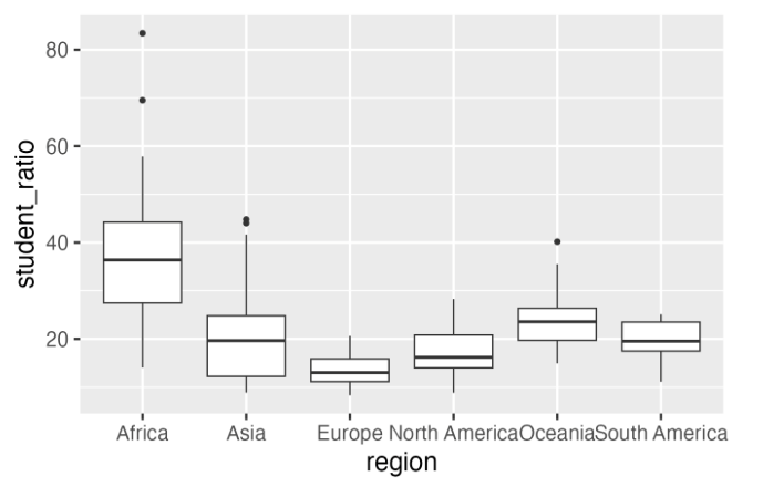
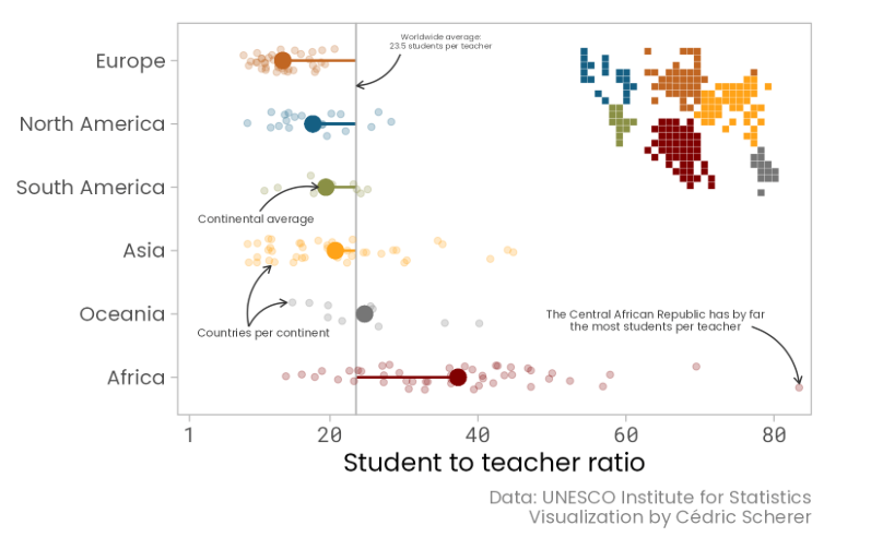
Take a closer look at the graph above.
Can you use scale_y_log10() to transform the y-axis to a log scale? 🤓
How would you shade the area below the curve? 🤔
Tweak the code and run it — right here in your browser!